
According to McKinsey’s 2025 AI report, 75% of companies use AI in at least one business function—but most lack visual pipelines that support trust, traceability, or real-time decisions. Failures don’t come from the models—they come from how outputs are delivered and interpreted under pressure.
This guide explores how data mining and data visualization work in a real pipeline. We’ll show how to make visualization part of the architecture, not the afterthought—so your insights stay clear under pressure, survive audit, and match how real teams work, not just how dashboards look.
That means understanding how raw data is structured, filtered, aggregated, and translated into visual data mining that a pricing analyst or executive can act on without second-guessing it.
How Data Mining and Data Visualization Work Together

Before a chart shows up on a dashboard, someone makes a dozen design choices—what to show, what to skip, who will see it, and how often it updates. But in production pipelines, these aren’t design decisions—they’re part of the data mining architecture itself.
Why Analytics Needs Visual Translation
Most mined outputs don’t tell a story—yet. They’re rows, scores, clusters, and confidence intervals.
But product managers, analysts, and revenue leads don’t read models. They read patterns, risk signals, and decision points.
That’s where visual translation comes in. Done right, it enables:
- Streamlined insight delivery to teams who don’t touch the pipeline
- Shared understanding between data and non-data roles
- Contextual framing of model output: not just what changed, but why it matters
- Reduced misalignment and tool fatigue in analytics consumption
Use Case Example:
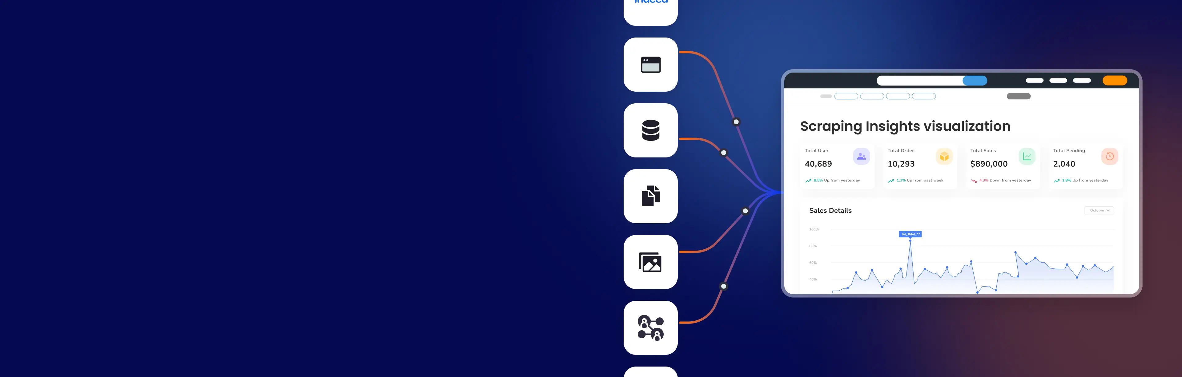
A pricing analyst at a retail client receives raw model output showing competitor SKU volatility. Without visual translation, the insight is lost in a CSV. With GroupBWT’s setup, the system renders grouped volatility zones by category and time window. The output: a dynamic heatmap tied to margin thresholds. That dashboard triggered 19 rule-based price adjustments in its first week.
What a Full Visual Pipeline Looks Like

Visuals shouldn’t be slapped on post hoc. A complete pipeline considers data mining and data visualization together, from structure to rendering.
Key stages in a working pipeline include:
- Structuring outputs to support user-facing questions (e.g., “Which SKUs moved the most last week?”)
- Using visual data mining to group, contrast, and highlight changes
- Rendering outputs at the right fidelity per user: analyst sees detail, VP sees trend
- Embedding feedback loops that track not just what’s viewed, but what’s acted on
When systems lack this flow, insights stay buried or get distorted.
But when the pipeline aligns logic to view, you build decisions that scale, dashboards that reflect reality, and reporting that survives audit review.
Our approach to Web Scraping in Data Science ensures both logic alignment and visual interpretability.
Visualization isn’t a final touch—it’s the decision interface embedded in your system architecture.
If your BI tools mislead or misalign, fix the pipeline, not the colors.
Why Visuals Mislead Users
Not every breakdown in data mining and data visualization comes from models or logic. Many failures trace back to visualization tools that weren’t designed for production pressure. This section outlines where even enterprise-grade platforms fall short—and why aligning tools with roles and flows matters more than chart types.
When Visualization Tools Fail Under Load
Even top-tier BI tools aren’t built for everything. Problems often arise not from the visuals themselves, but from how tools treat data flow, updates, or user roles.
Typical failure points include:
- Over-aggregation: Hides volatility or edge cases critical for pricing and ops
- Latency mismatches: Dashboards update more slowly than the system decisions they inform
- Static rendering logic: Charts can’t adapt to structural changes in data schemas or model outputs
- Role blindness: A single dashboard tries to serve marketing, ops, and product, all with different needs
Example:
One GroupBWT client used a popular BI tool to track carrier pricing shifts. When their API schema changed during peak season, the tool silently ignored new fields. No errors appeared—just flatlined trends. The team missed a pricing window that cost 12% in revenue margin. We replaced the layer with role-specific visual rendering tied to schema-aware logic.
Why Tool Choice Isn’t Neutral
Many teams assume visuals are “just how you show the data.” But the wrong tool can reshape the meaning of what’s shown.
What to ask when selecting or assessing tools:
- Can the tool handle data mining and visualization like dynamic clustering or outlier exposure?
- Does it support visualization data mining where output logic—not user selection—drives view type?
- Can you version, audit, and trace visual logic in the same way as data pipelines?
The reality: Visualization tools that can’t adapt to your pipeline’s structure will distort it.
Data pipelines don’t just produce numbers—they produce meaning. And if your tool flattens or delays that meaning, even accurate models won’t help.
We’ve rebuilt dozens of client setups where visuals masked model failure or hid schema drift.
How to Make Visuals Traceable

This section explains how to design visual layers that don’t just “look good”—they stand up to audit, operational review, and cross-team interpretation. We move from assumptions to safeguards: what it takes to make data visualization in data mining workflows explainable, scalable, and compliant in production.
Start With Visual Use Roles, Not Chart Types
Designing visuals around aesthetics or templates often breaks down when roles change. Instead, build visuals around the decision-maker’s mental model.
Ask:
- What does this person already know?
- What do they need to act?
- What happens if they interpret it wrong?
Visual layers must:
- Prioritize role-specific insights (e.g., finance ≠ product ≠ growth)
- Minimize ambiguity in information visualization and visual data mining
- Explain model limitations, do not hide them
Example:
For a healthcare analytics team, we built layered visuals with toggles for clinical accuracy vs. reimbursement risk. Doctors needed clinical trends; CFOs needed cost band shifts. Without segmentation, each group misunderstood the signal. Visuals must respect role logic, not flatten it.
Add Structural Metadata to Every Layer
Visuals must show their context, not just numbers.
That means embedding metadata that helps interpret, validate, and trust what’s shown.
What to surface visually:
- Source timestamp (not “last updated”)
- Pipeline version or model logic
- Aggregation level (e.g., per SKU, per region)
- Sampling method or exclusions
This turns visualizations from passive charts into active audit artifacts.
“We now ship metadata with every dashboard component. If something feels off, users can trace back to the source logic—no guesswork.”
—- Dmytro Naumenko, CTO
See how Enterprise Data Integration ensures traceability from source to final visualization.
Test Visual Failures Before They Reach Stakeholders
A good visual is like a contract—it must hold up under pressure. That means testing:
- Chart stability when upstream data breaks
- Interpretability by non-technical users
- Cross-device and timezone behavior
- Model evolution (e.g., new features, retraining)
Failing silently is not an option. Build in failure modes, fallbacks, and warnings.
Example:
One logistics platform used dynamic map overlays for delivery analytics. When map layers failed, delivery leads saw 0% change. We added a fallback mode that warns users and gives snapshot stats. Visuals must break visibly, not invisibly.
Audit-surviving visuals aren’t about style—they’re about structure, safeguards, and trust. Designing for roles, surfacing metadata, and testing failures turns dashboards into operational tools, not decoration.
We’ve already done this at scale, from pricing analytics to healthcare R&D.
Visuals are the last mile of insight—and the first to fail if designed wrong. And trustworthy visuals don’t begin with charts—they begin upstream.
From the moment raw data enters the system, every transformation matters. Read how we structure ETL for real production systems in our ETL and Data Warehousing guide.
Visualization defines what’s actionable. One architecture, three interlocking layers. This integration is handled within our Data Engineering systems that stitch together ETL, validation, and visual output logic.
Why Visual Layers Fail Without Architecture

Most visualization failures don’t come from the chart itself. They come from what happened before it, during collection, transformation, or mapping. This section explains the operational flow that turns mined data into reliable visuals: from ETL and logic alignment to audit-safe rendering. When done right, you don’t just see insights—you see where they came from and why they matter.
From Raw Data to Clean Inputs
Visual-ready outputs are stored through structured pipelines or Data Warehouse solutions tailored to BI workloads.
Before visualizing anything, the data must be safe to show. That means not just cleaning rows, but understanding context and purpose. Without that, even a “correct” chart misleads.
Here’s what happens at this stage:
- Extracting source data via ETL and filtering noise
- Normalizing formats across APIs, logs, or manual inputs
- Running validation to detect missing or skewed fields
- Tagging context (region, time window, user scope) for later rendering
Visualizing unprocessed outputs looks fast, but hides the complexity that breaks trust later.
Clean inputs are not the goal—they’re the baseline. From here, mining logic models structure, outliers, and signal.
Our Data Extraction services ensure raw inputs are validated, clean, and structured for visualization logic.
Data Mining Before Visualization
The real insights come from mining logic, not design. GroupBWT’s Data Mining services structure logic layers that expose clusters, patterns, and thresholds with audit-ready precision.
Before deciding how to show something, teams must understand what the data means. In real pipelines, this layer includes:
- Classification, clustering, and pattern modeling
- Calculating relevant aggregates and thresholds
- Eliminating outliers or adding baseline comparisons
This step aligns with the core goal of data visualization in data mining: making sure you’re not visualizing artifacts, but genuine structures, so what’s shown can be audited back to its source logic.
Matching Visual Format to Data Logic
This is the final stage in the visualization architecture. After data is mined and modeled, the format must now convey insight with precision.
Different data types require different visual strategies. A map is not a table. A heatmap is not a timeline. And rendering the wrong format breaks more than UI—it breaks decisions.
Here’s what goes into format mapping:
- Aligning chart type to data structure: trend, category, comparison
- Using data visualization techniques in data mining to highlight relationships
- Balancing detail with readability for the target role (analyst ≠ VP)
This is where visualization in data mining becomes systemic, structured by data logic, not design instinct. Done wrong, it hides issues. Done right, it surfaces them before damage spreads.
“If the chart looks fine but no one acts on it — that’s a failure. Our job isn’t to visualize trends. It’s to trigger the right decision at the right time, for the right role.”
— Eugene Yushenko, CEO
When visualizations are built on raw or mismatched logic, they might impress, but they don’t hold up in production. Our approach aligns the full pipeline—from data mining to visualization—so your team doesn’t just “see more,” they understand more.
Three Visualization Types That Often Lie
Not every chart lies—but some lie more often than others. Especially when teams default to familiar formats without matching them to data structure, user intent, or decision context. This section breaks down where visualization techniques in data mining create misleading outputs, and how to prevent statistical distortion before it enters production.
Where Pie Charts Break in Production
Pie charts can work well in static presentations, but in operational dashboards, they often obscure more than they reveal. As the number of segments grows, clarity drops, especially when comparing small percentage changes or showing time-based shifts. They favor visual comfort over data precision, which doesn’t hold up in fast decision cycles.
Here’s what usually goes wrong:
- No baseline or directional logic (e.g., what’s improving?)
- Ambiguous visual weight across categories
- No support for change over time or trend surfacing
Example:
A retail team visualized regional revenue splits via pie charts. But 3% vs. 4% looked identical. The insight? Hidden. We rebuilt the logic into stacked bar comparisons with delta lines. Actions tripled.
Visual truth ≠ aesthetic comfort. If the user can’t read risk from shape, it’s noise, not clarity.
When Heatmaps Distort Reality
Heatmaps are common in data visualization in data mining, but they often mislead more than they reveal. Why? Because color intensity is easy to misinterpret.
Where things go wrong:
- Overloaded grids with poor contrast scaling
- Lack of contextual benchmarks
- Readers interpret red as “bad,” regardless of the threshold
Example:
A product analytics team flagged “high churn” zones in red. But thresholds weren’t normalized by geography. A 9% churn in Asia looked worse than 17% in North America. The fix: annotated thresholds + dynamic legend scaling.
Heatmaps need more than color. They need calibration, annotation, and sanity checks.
The Problem with Scatter Plots in Business
Scatter plots are great—until they hit a business dashboard. Then they often cause more confusion than clarity.
Why do they fail?
- No dimensional reduction (too many points to read meaningfully)
- No clustering or pattern grouping
- Overplotting leads to unreadable blobs
Example:
A BI team plotted product performance across four variables. The result: a blur of 6,000 dots. Executives ignored it. We added segmentation layers and interactive filtering. Same data—now used in board reviews.
Scatter plots show potential—but need structure, not chaos. Without it, they erode trust in the data.
“When our dashboards started driving decisions instead of just reporting them, we realized how dangerous the wrong chart could be. One misread heatmap cost us two weeks of campaign spend in the wrong region.”
— Oleg Boyko, COO
Chart selection isn’t aesthetic—it’s strategic. The wrong visual doesn’t just confuse—it delays action, erodes trust, and buries insight. Pie charts, heatmaps, and scatter plots each have a place—but only when paired with data logic, user role, and visual governance.
Making Dashboards That Speak to Everyone
Not all dashboards fail because of bad data—they fail because the right people don’t see the right story. This section explores how to design dashboards that work across roles, not just for analysts. The goal isn’t one-size-fits-all—it’s one truth for many views.
Designing for Technical and Business Roles
Data scientists want traceability. Sales wants movement. A single dashboard can’t serve both—unless it adapts by role.
- Layered interfaces: toggle views for depth vs. summary
- Language-neutral signals: no jargon, only what matters
- Metric clustering: connect visuals to KPIs that each team owns
In multi-role pipelines, we often expose the same logic through different views—for example, data scientists get statistical granularity, while revenue teams see only net impact.
From Model Outputs to C-Level Buy-In
Executives don’t want plots—they want implications. To drive buy-in, dashboards must show what changed, why it matters, and what to do next.
GroupBWT’s AI-powered data scraping augments dashboards with model-based reasoning and scoring.
This means surfacing:
“If I have to decode the chart, I won’t use it. But when the insight says ‘this product slipped 4% on margin due to regional promo lag’—that gets attention.”
— Olesia Holovko, CMO
Dashboards should translate model output into a business signal, so the C-level doesn’t have to translate insight back into risk or strategy.
A dashboard isn’t just a report; rather, it is an interface between AI, product, and leadership. This requires applying data mining visualization techniques that surface not just metrics, but meaning.
Tools That Work — and Why
Most teams choose tools based on habit, not on how well they support data mining and visualization in production.
Tool choice must reflect how visualization in data mining works under real load. Visualization techniques in data mining must survive schema changes, version drift, and team handoffs.
Tableau vs. Power BI vs. Python
Enterprise teams often ask: “Which tool should we use?” The answer isn’t which, but where.
- Tableau: Great for interactive slicing, poor at deep audit logging
- Power BI: Easy role-based security, but latency under high volume
- Python: Full flexibility, but requires engineering overhead to productionize
Example:
In one insurance analytics project, we started with Tableau, hit a governance wall, and transitioned to a hybrid: Python-generated tiles + Power BI orchestration. No trade-off in trust.
We treat these not just as BI platforms, but as data mining visualization tools tied directly to system logic.
Pitfalls When Using D3.js in Production
D3.js is a highly flexible library for visualizing data mining, but in production environments, it can become brittle unless hardened with audit layers, version control, and robust fallback logic.
Common issues include:
- Lack of error fallback when schema changes
- Custom logic that can’t be audited or versioned
- Developer-specific visual syntax, hard to hand off
One client used D3.js for real-time logistics views. When map tiles failed, the fallback didn’t trigger. Users saw old routes for three days—no warnings. We rebuilt using audited templates with versioned logic.
D3.js remains one of the most fragile data mining and visualization tools unless hardened with audit logic.
Visualization tools must support auditability, not just animation.
Choose tools that fit your architecture, not just your design brief.
Where We Go Beyond BI Tools
Many dashboards look great until compliance knocks. Most teams focus on visual delivery, not auditability or bias detection. Here’s where we go beyond: visual governance that builds trust, not just interaction.
Visual Bias Audits
Dashboards encode decisions and biases. We run bias audits on:
- Sampling logic
- Label visibility
- Demographic distortion
- Multilingual rendering
Example:
In one legal analytics case, we flagged skew from missing verdict data in rural courts. A standard dashboard showed “urban skew,” but our visual audit showed the omission. Fixing that changed the downstream model allocation logic.
We apply information visualization and visual data mining logic to test for distortions across sampling and demographic slices.
Compliant Visualization Design
For regulated sectors, visual layers must be legally explainable. That means:
- Per-jurisdiction filtering
- Consent-based signal surfacing
- Contextual annotations for interpretation
“We used to get nervous before compliance reviews. Now our dashboards explain themselves.”
— Head of Compliance, Pharma Client, Under NDA
Visual Layers for AI Explainability
When AI drives decisions, you can’t afford opaque visuals. We design with:
- Feature tracebacks per chart
- Visual deltas pre/post retraining
- Explainable AI overlays for critical flows
In one banking use case, we embedded LIME-based attribution explanations right into loan approval visuals. No black boxes—just traceable logic.
Our visuals don’t just deliver data—they deliver legal clarity, stakeholder trust, and model safety.
Build Visualizations That Don’t Lie
You don’t need more data mining and data visualization frameworks. You need ones that don’t distort meaning.
What sets trusted visuals apart:
- Clear data lineage
- Role-aligned insights
- Auditable rendering logic
We build custom data systems that survive audits, clarify decisions, and scale with your system, not just your screen.
FAQ
-
How can data visualization be made consistent across platforms like web, mobile, and embedded apps?
To ensure visual consistency across environments, dashboards must be built with responsive logic, shared rendering templates, and role-aware design tokens. This means visual behavior is governed centrally, even when deployed across different frontends. We often abstract the visual logic layer from the delivery layer entirely to maintain alignment under change.
-
What’s the best way to transition from a data visualization proof of concept to production?
Start by validating your visual logic on real data with real users, not just sample dashboards. Then version your transformations, embed testing hooks, and enforce data contracts between layers. We treat every visual as a production component, not a mockup, so it inherits the same reliability as any backend API.
-
How do you measure the ROI of visual analytics systems?
We measure ROI by tracking which decisions were influenced, accelerated, or prevented due to visuals, and what business impact that produced. That includes an uplift in margin, avoided downtime, or faster approvals. We also track adoption per role: if key decisions aren’t using your dashboard, there’s no return.
-
What’s the role of user feedback in designing visual layers?
Feedback isn’t an afterthought—it’s a design input. We embed feedback capture directly in dashboards and correlate that with usage logs and decision audits. The goal is not to ask users what they like, but to find out whether visuals made them act faster, with more confidence, and fewer errors.
-
How do you customize visualization logic for different departments without fragmenting the system?
We separate data logic from view logic, then define per-role view profiles that reuse core models with different presentation rules. This avoids duplicating dashboards while tailoring signal delivery. It’s not about building more charts—it’s about showing the right one, to the right role, at the right moment.